Sunday, April 8, 2012

Selective Color Photography

Over the weekend for Easter, I visited my Grandma's farm. I thought this would be the perfect opportunity to get some great photos of the farm. Before my grandpa passed away 10 years ago, my grandparents raised, showed, and sold llamas. They also had a number of peacocks, and both of these sort of exotic animals are now very sentimental to me. While editing some of the photos I had taken, I came across a photo of a peacock feather and decided to try using selective color, which is an effect in which one object within the photograph is in color, while the rest or background of the photo is greyscale or black & white. This easy effect can make the object in your photo really stand out, and make your image very unique! There are a number of ways to create this affect in Photoshop, but the easiest three-step process I've learned is as follows: 
1.) Opening your photograph in Photoshop, select the Lasso Tool in the panel and decide which part of the image you want in color.
2.) Next duplicate your image layer (Ctrl+J) 
3.) Making sure the background layer is selected, you must desaturate the top layer - Image>Adjustments>Desaturate OR (Ctrl+U) to make the greyscale or "black & white" selection a uniform color 3.
Tweet me at @htt81490 and let me know which photos are your favorite. Make sure you try the selective color effect when editing your next photograph! 


Tuesday, April 3, 2012

Packaging Design (Coffee)

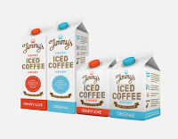
Packaging design is one of the most creative design applications in the world today. Throughout the past couple of decades, packaging design of thousands of products has taken off creatively, allowing designers to showcase personal artistic qualities. Coffee is an important agricultural export commodity in a number of different countries. It is one of the most-consumed beverages in the world, along with a strong, established audience behind the product. 
Today, I'll be showcasing various coffee packaging design by various designers. Like most product applications, designers' main focus is to capture the attention of consumers, whether that be through the use of color, typography, or image. Depending on your specific product, the packaging design is incredibly important, as it is sometimes the first view of the product on the shelf. Below are a few examples of Coffee packaging design displaying strong uses of typography, image, color, and also combinations of all. Be sure to check out http://ow.ly/a3EQ1 for more examples of creative coffee packaging design! Tell me some of your favorite packaging designs! Tweet me at https://twitter.com/#!/htt81490 (@htt81490). 


Abadidabou Sarah Esteje

Abadidabou Sarah Esteje is a French artist specializing in intricate and beautifully detailed animal and figurative portraits drawn with a Bic pen. Her illustrations are beyond impressive, not to mention incredibly realistic. Using such simplistic mediums including paper and a pen, Esteje easily captures the life and essence of each drawing she tackles. I also take a particular interest in drawing portraits and have done many for family members and various people I know. There is something about the artistic quality a drawing or illustration brings as opposed to a photograph. Being able to grasp the vitality of a person's face or animal's characteristics is something very special and should be appreciated. Below are a few of Abadidabou Sarah Esteje's drawings. I've also attached two of my own drawings at the bottom of babies I was commissioned to draw, where I used graphite as my medium of choice. Hope you enjoy! 


Thursday, March 22, 2012

Animal Logo Designs

As a follow-up to my previous blog on typographic logo design, I decided to search for more innovative logo designs that were a bit different, visually. I came across a link to a site displaying 30 stylish animal logos which I found very interesting. Logos are usually either typographic or image based and the ones displayed here are image based and centered around incorporating animals as the visual focus. Sergey Bobenko and Jerron Ames have created some of these stylistic and wonderful logos shown below. Most logos that are image based usually incorporate some kind of type, reiterating the company name or slogan. This in mind, the type and the image must cooperate and be equally important and cohesive when creating professional logos. Although the image might be the more important aspect the company wishes to resonate within audiences' minds, the type visually aiding the image must be just as strong. Here are some of my favorites from the website. Check out the website http://neatdesigns.net/30-stylish-animal-logos/ to look through more logo designs, as well as examine the ones shown below. Tweet me @htt81490/https://twitter.com/#!/htt81490 and tell me your favorites from the website or other typographic or image based logos you may have found!


Thursday, March 8, 2012

Architectural Staircases

Although my blog pertains mainly to two dimensional design such as graphic design, painting, and photography, I came across some stunning photographs of architectural staircases that I thought were worthy enough to share! Architecture is extremely important and has been for centuries, allowing the architect or designer to add their own personal creativity to the space. I've always thought that unique and visually pleasing staircases really add flare and beauty to a house or architectural space. I'm a huge fan of spiral staircases and hope to incorporate one into my own house in the future! Here are some of my favorite architectural staircase designs from http://enpundit.com/2012/amazing-staircases. Be sure to check out more and find some of your favorite architectural designs! 


Tuesday, March 6, 2012

Logo Design 101


I took an Identity Systems Design class last semester where over the course of the semester we were able to create a fictional company and design everything for that business including the company logo, packaging, t-shirt design, stationary, and uniform design, among other elements. The most important of these elements is the company's identity, or logo. This is what represents the company and is seen on all material produced by the business. There are three main methods of creating a logo identity design. The first entails using a symbol or pictogram to represent a company’s identity. The second technique used in constructing logos includes the use of clever typography to spell out the company name or the initials the company wishes to use. The third approach is a combination of both symbol and typography. The decision on whether to use a symbol or wordmark logo depends on the nature and overall vision the business wishes to portray.
Typographic logos are usually designed for companies whose name is classic and well-known. With clever use of type setting certain fonts, you can allow your target audience to easily remember your brand identity with a long-lasting impression. For instance, The Coca-Cole logo has maintained its exclusive corporate identity by employing  a distinctive typographic logo, no symbols or icons related with the brand. Similarly, Fed-Ex is also an ingenious  example of typography in logo design. By skillfully using a simple font, the designer incorporated an arrow between the ‘E’ and the ‘X’ to signify progress and continuous growth within the company, also relating to what the company does and is known for: transporting. McDonald's can be seen as both a symbol logo and also a combination when seen with 'McDonald's' under the large yellow arches. Many car companies, such as Dodge and Lexus incorporate only symbol identity design, making their brand of vehicle distinctive from the competition. 
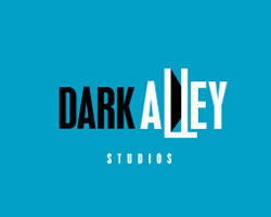
Here are some of my favorite examples of just typography logo design and also combination logo design for small businesses. Make sure to check out http://www.logoblog.org/typographic-logo-designs/ for more examples of innovative and creative identity design! The next time you look at the packaging of your soup can, water bottle, or even your own company's logo, ask yourself which type of logo design was created for that brand!


Sunday, March 4, 2012

Business Card Design


Business cards are generally recognized as being boring and simplistic in design, created and used for one purpose: to invite clients to patronize the products and services that you or your company offers. Throughout the last couple of decades, designers especially have found ways to really get creative with their business cards and other business stationary. There are many great ideas as to how a card should be designed in order to catch the the viewer's attention and also help build a brand name and make it successful. I spotted some of these uniquely designed business cards, and thought I would share some of them with you! Below are the designers and their business cards along with a little information on the creation of their designs! I love some of these ideas.. they would be awesome to try! Check out more of these unique and innovative business card designs at http://ow.ly/9rCeu

Megan Harrigan

"I created my 3-dimensional business cards in order to stand out from everyone else. I wanted to get my viewer involved and give them a little surprise. I make each one by hand and I print them myself at home. Each card only takes about 5 minutes to produce and it is totally worth the extra effort when I see the look on clients faces when they figure it out. These were inspired by my bubbly and in your face personality. I’m not just a flat card." 


Matthew Adamson

"Designed as part of a self promotion project at university, my business cards reflect the idea of selling yourself in a very literal way! The designs are based on ‘tart cards’ that are found in phone boxes. But instead of offering adult services, I highlighted my design skills, key attributes and personality, whilst on the reverse are my contact details and a lolly.

To inkeep with the crude and simple feel, the cards were all homemade using a regular four colour ink jet printer. The designs were printed onto a selection pack of coloured 160gsm card. A sticky label of my contact details were then stuck onto the reverse of each card. And for the final touch, a lolly stuck to each one!"

Business Card for Christope Nemet

This business card was obviously inspired by a studio monitor speaker, since Christoph is a sound designer and composer an is also one of my best friends, I had easy access to a living example.