Over the weekend for Easter, I visited my Grandma's farm. I thought this would be the perfect opportunity to get some great photos of the farm. Before my grandpa passed away 10 years ago, my grandparents raised, showed, and sold llamas. They also had a number of peacocks, and both of these sort of exotic animals are now very sentimental to me. While editing some of the photos I had taken, I came across a photo of a peacock feather and decided to try using selective color, which is an effect in which one object within the photograph is in color, while the rest or background of the photo is greyscale or black & white. This easy effect can make the object in your photo really stand out, and make your image very unique! There are a number of ways to create this affect in Photoshop, but the easiest three-step process I've learned is as follows:
1.) Opening your photograph in Photoshop, select the Lasso Tool in the panel and decide which part of the image you want in color.
2.) Next duplicate your image layer (Ctrl+J)
3.) Making sure the background layer is selected, you must desaturate the top layer - Image>Adjustments>Desaturate OR (Ctrl+U) to make the greyscale or "black & white" selection a uniform color 3.
Tweet me at @htt81490 and let me know which photos are your favorite. Make sure you try the selective color effect when editing your next photograph!
Packaging design is one of the most creative design applications in the world today. Throughout the past couple of decades, packaging design of thousands of products has taken off creatively, allowing designers to showcase personal artistic qualities. Coffee is an important agricultural export commodity in a number of different countries. It is one of the most-consumed beverages in the world, along with a strong, established audience behind the product.
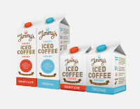
Today, I'll be showcasing various coffee packaging design by various designers. Like most product applications, designers' main focus is to capture the attention of consumers, whether that be through the use of color, typography, or image. Depending on your specific product, the packaging design is incredibly important, as it is sometimes the first view of the product on the shelf. Below are a few examples of Coffee packaging design displaying strong uses of typography, image, color, and also combinations of all. Be sure to check out http://ow.ly/a3EQ1 for more examples of creative coffee packaging design! Tell me some of your favorite packaging designs! Tweet me at https://twitter.com/#!/htt81490 (@htt81490).


